Creating Places: A Citizen Observer's Look at Nashville's Built Environment
Writer's Note: William Williams' interest in the manmade environment dates to 1970, at which point the then-young Williams started a collection of postcards of city skylines. The collection now numbers 1,000-plus cards. Among the writer's specific interests are exterior building design, city district planning, demographics, signage, mixed-use development, mass transit and green/sustainable construction and living. Williams began his Creating Places column with The City Paper in February 2005. The column in its original form was discontinued in September 2008 and reinvented via this blog in November 2008. Creating Places can be found on the home page of the website of The City Paper, at which Williams has worked in various capacities since October 2000.


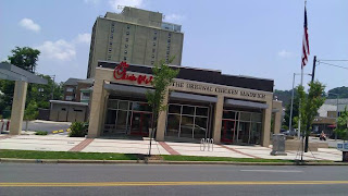
Not all of the newly-built, or renovated, fast food restaurants are 'bad for the built environment". While I would never term them a "masterpiece", many of the new McDonalds are much better than the one's they've replaced, with clean, modern design, nice landscaping and smaller signage. Even Chick-fil-A stores look decent with brick and well maintained exteriors. If only one could avoid the religious praise Muzak inside and the employees constantly saying "my pleasure".
ReplyDeleteA-Mous,
ReplyDeleteYes, many of the new-look McDonald's buildings look fairly attractive. There is move away from the "cartoonish" and "garish" themes these buildings long displayed and toward a more streamlined and contemporary aesthetic. And that is good.
WW